<img src="/images/sunset.jpg" alt="Picture of a Ha Long Bay sunset">New! My 44-page ebook "CSS in 44 minutes" is out! 😃
Defines an image inserted in the web page.
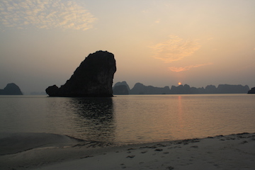
Example: Copy
<img src="/images/sunset.jpg" alt="Picture of a Ha Long Bay sunset">Example: Copy

<!-- For responsive images, use srcset and sizes -->

<img src="/images/sunset-360.jpg"
  alt="Picture of a Ha Long Bay sunset"
  srcset="/images/sunset-360.jpg 360w,
          /images/sunset-720.jpg 720w,
          /images/sunset-1440.jpg 1440w>"
  sizes="(min-width: 800px) 720px, 360px">
src
The URL where the image is hosted.
Required.
"/images/tiramisu.jpg"
You can use a relative URL.
"https://htmlreference.io/images/traffic.jpg"
You can use an absolute URL.
alt
Alternative text to describe the image if it's not available. Used by screen readers.
Required.
"Picture of a man standing in front of the Dragon's Pearl boat"
Describe the image as if it was not present.
srcset
Defines a list of different sources for the same image. The browser will choose the best one to use.
"/images/[email protected] 2x"
You can define a pixel density descriptor like 2x. In this case, [email protected] is 720px wide.
<img src="/images/sunset.jpg"
     srcset="/images/[email protected] 2x"
     alt="Picture of a Ha Long Bay sunset">
The browser will either use sunset.jpg or [email protected] depending on the space available, the pixel density, etc.
                      "/images/sunset-360.jpg 360w,
 /images/sunset-720.jpg 720w,
 /images/sunset-1440.jpg 1440w"
You can use a width descriptor like 360w. This value is divided by one of the source sizes (defined in the sizes attribute) to obtain the pixel density.
<img src="/images/sunset-360.jpg"
  alt="Picture of a Ha Long Bay sunset"
  srcset="/images/sunset-360.jpg 360w,
          /images/sunset-720.jpg 720w,
          /images/sunset-1440.jpg 1440w>"
  sizes="(min-width: 800px) 720px, 360px">
sizes
Defines a list of different source sizes. You can combine each of them with a media query.
"(min-width: 800px) 1440px, 720px"
The browser will use the 1440px image (defined in srcset) if the viewport is larger than 800px.
It will use the 720px otherwise.
<img src="/images/sunset-360.jpg"
  alt="Picture of a Ha Long Bay sunset"
  srcset="/images/sunset-360.jpg 360w,
          /images/sunset-720.jpg 720w,
          /images/sunset-1440.jpg 1440w>"
  sizes="(min-width: 800px) 720px, 360px">
height
Defines the height of the image.
"240"
The height in pixels.
width
Defines the width of the image.
"120"
The width in pixels.